Article
July 23, 2026
6 min read
Your Team Needs Fewer Dashboards and More Dials
Metrics become management only when teams connect signals to authorized controls, decision rights, guardrails, and a memory of what happened next.
By Cristiano Pierry
Most product organizations have a meeting that looks responsible from the outside. A dashboard is on the screen. A line moved. Someone asks whether the movement is real, then asks for a cut by platform, market, cohort, or surface. The team agrees to investigate. Another chart appears before the next meeting.
None of this is irrational. The people in the room are trying to make decisions from evidence rather than opinion. But a strange thing can happen over time: the dashboard gets better while the operating model stays exactly the same. The team can see more clearly that something changed, but it still cannot answer the harder question quickly enough:
What are we allowed to change in response?
Product teams need control surfaces as well as visibility. A dashboard tells you the room is too hot; a dial lets you change the temperature.
When an organization invests in visibility without defining its available interventions, decision rights, and guardrails, it eventually stops operating the product and starts watching telemetry.
Visibility without agency
Good dashboards are necessary. They help teams detect movement, establish shared facts, expose disagreement, and inspect systems that would otherwise remain invisible.
That visibility is especially important in search, recommendations, and AI products, where a simple interface can hide retrieval, ranking, personalization, business rules, safety, and experimentation. Without reliable evidence, one surprising recommendation can become a judgment about the whole system. One executive screenshot can turn into a product review, and one loud complaint can become the roadmap.
The problem begins when visibility is mistaken for management. A dashboard may show that search reformulations increased, a recommendation row received impressions but few starts, or an AI assistant produced confident answers followed by more user corrections. It may show that an offline relevance metric improved while a product guardrail moved in the wrong direction.
That information matters. It still leaves the team to decide what intervention is available, who owns it, which range is acceptable, and how quickly the system can be changed. Without those agreements, the dashboard creates awareness without agency.
Build the surface around a decision
The useful unit is the operating surface around an important recurring decision.
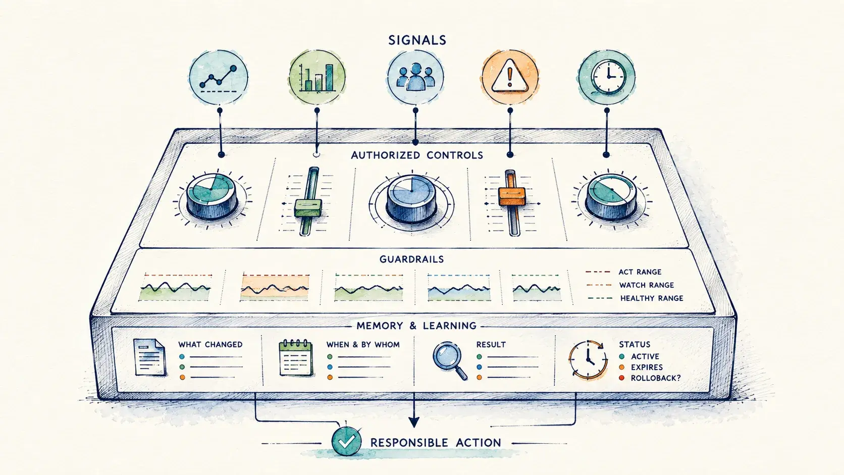
It connects a signal, an authorized control, a guardrail, and a memory of what happened after the last change. That combination lets a team move from observation to responsible action.
The thermostat metaphor has limits. Product systems are noisy, delayed, and interconnected. Changing a ranking weight can affect relevance, diversity, latency, and business outcomes at the same time. Increasing exploration may help people discover more of the catalog while making the experience feel less predictable. A temporary promotion may improve starts while displacing organic recommendations.
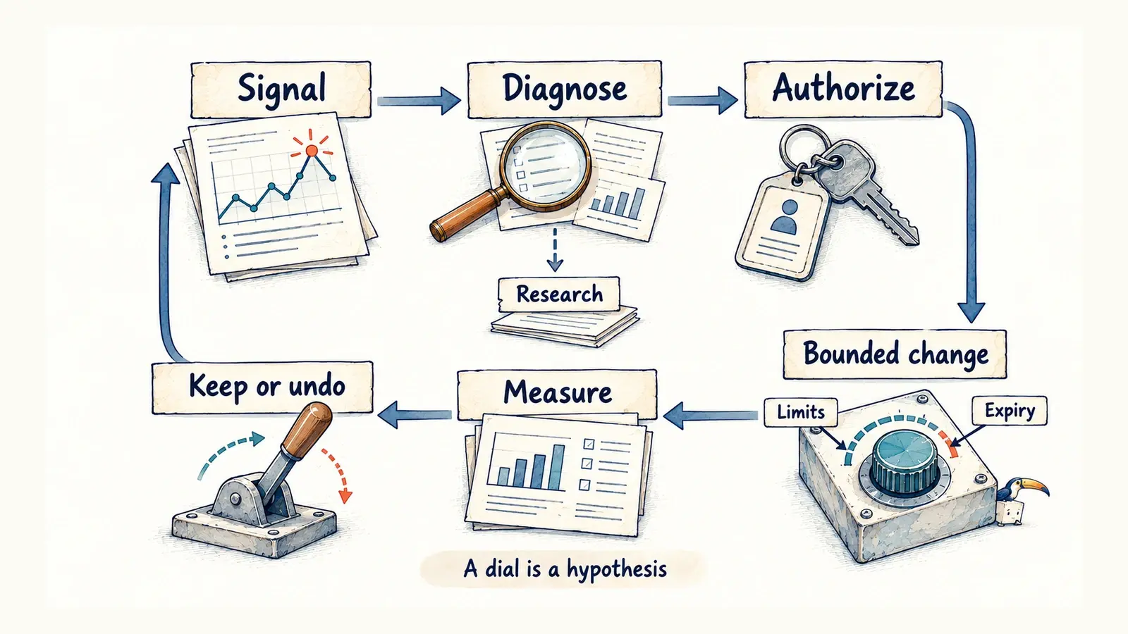
A dial is not proof of control. It is a governed hypothesis about how to intervene.
Not every signal needs a dial. Some should trigger diagnosis, research, or long-term learning. The operating surface should make that distinction clear instead of implying that every movement deserves an immediate product change.
Before deciding what the dashboard should display, start with the decision it supports. If a metric would never change what the team does, it may belong in a report, diagnostic notebook, or quarterly review. An operating surface has a narrower job: help the team act while the outcome can still be changed.
That requires a decision contract. The organization should know which movement requires attention, who owns the response, which control is available, and which guardrail limits it. The intervention also needs an expiration and evidence that would force a rollback.
Consider a temporary boost for a major content launch. Before launch pressure arrives, the team can decide which audiences qualify, how strong the boost may be, how long it can remain active, and which user signal should end it. A holdout may be necessary to learn whether the boost created demand or borrowed attention from something else.
Most product decisions operate inside a range. Too little exploration makes a recommendation system stale; too much makes it feel random. The useful question is where the healthy range ends, where the watch range begins, and what evidence authorizes an intervention.
The contract also makes disagreement more useful. Marketing may see insufficient exposure while data science sees model uncertainty and engineering sees instrumentation risk. A dial does not eliminate those interpretations. It forces the group to name the mechanism it is willing to change.
If the problem is exposure, what is the approved intervention? If it is relevance, which ranking input should move? If the product is making a claim it cannot support, who can narrow or remove that claim? If the data is unreliable, which quality check must pass before the metric is allowed to influence a decision?
Two teams may have equally good data. The one that can act responsibly has connected the data to decision rights.
Some dials should stay locked
More controls can create a different failure mode. A metric dips, and someone changes ranking. A launch underperforms, and someone raises exposure. A segment looks weak, and someone adds an exception. Each intervention may be defensible in isolation. Together, they can produce a system that nobody understands anymore.
A dial needs a purpose, an owner, an authorized range, and a measurement plan. It also needs a memory. The team should know what changed, why it changed, when it expires, and what evidence would justify undoing it. Without that discipline, dials become manual override culture.
That risk is particularly high in personalized products because different interventions can all change what a person sees. A constraint says something must or must not happen. A signal influences a decision. An editorial module gives a curated experience a legitimate product role. An exception admits that the normal system could not handle the case.
Those distinctions affect measurement, approval, and duration. They keep a business request from quietly becoming a permanent ranking signal and a product failure from becoming another permanent exception.
At portfolio scale, the organization also has to decide which controls are global and which remain local to a product, market, surface, or audience. A platform trust policy and a surface-specific promotion budget may affect the same experience while carrying different decision rights.
A unified visualization cannot resolve that difference. Standardizing the chart before agreeing on the metric definition and decision authority creates false comparability.
AI changes who can turn the dial
AI will make visibility cheaper. It can summarize metric movements, identify unusual segments, draft experiment readouts, and recommend next actions.
Incomplete interpretation can arrive with the speed and polish of a finished conclusion. Missing instrumentation, selection bias, novelty effects, and poorly defined metrics remain even when the analysis sounds complete.
An organization therefore needs to distinguish what an AI system may observe, explain, recommend, simulate, and change. Those are different levels of authority.
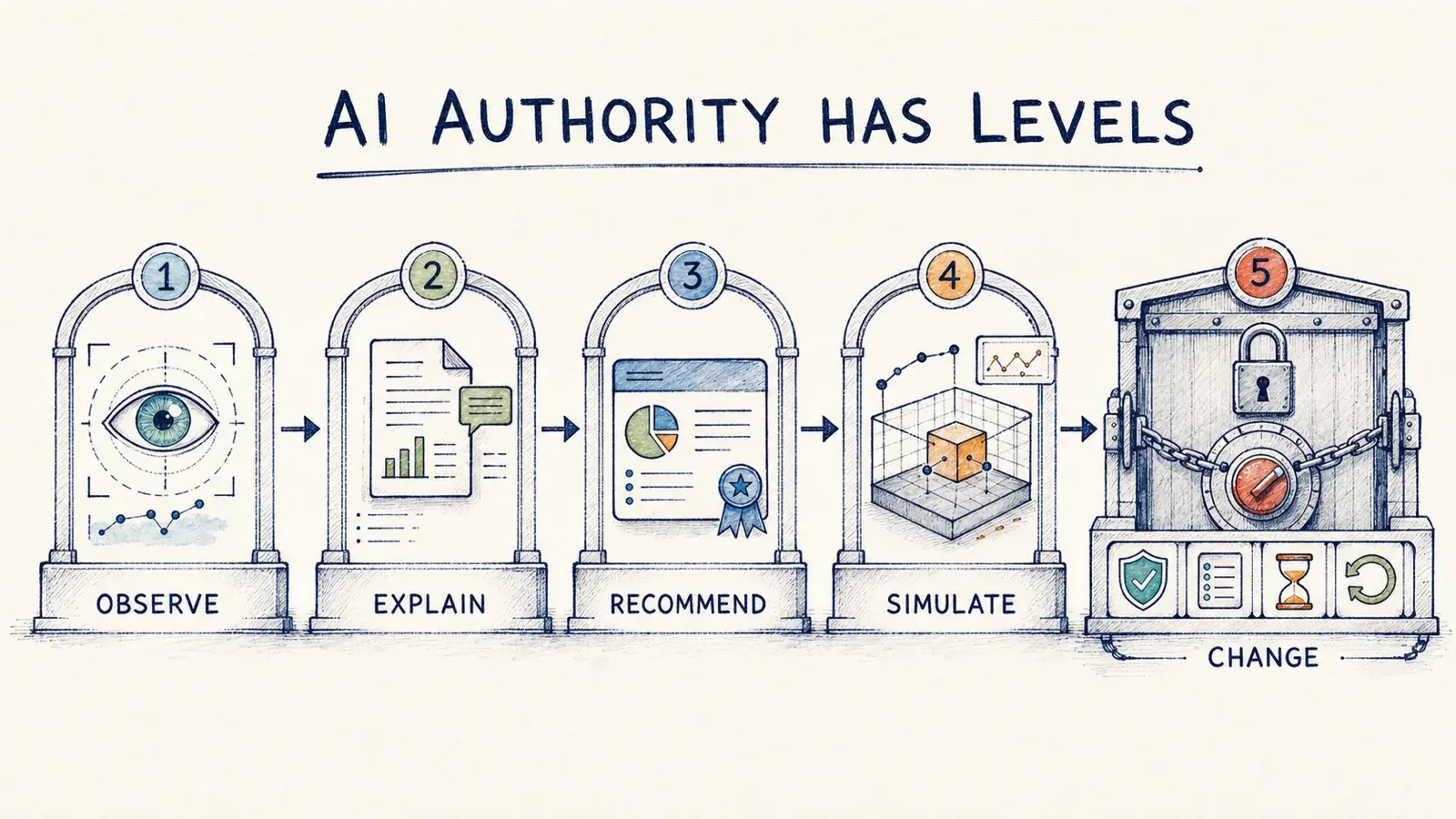
AI can reduce the cost of finding signals and proposing interventions. Leadership still has to decide which interventions are legitimate, who remains accountable, and which controls should stay locked because the cost of being wrong is too high.
The practical place to begin is one recurring decision that happens often enough to matter and slowly enough to govern. Build the surface around that decision. Show the signal, the authorized range, the owner, the active intervention, its expiration, and what happened after the last comparable change.
Then ask what the team would do if the number moved tomorrow. If the answer is still “we would look into it,” write the decision contract before adding the next chart.
This writing reflects my personal perspectives on product management, AI, and content discovery. It does not represent the official position of my employer or any affiliated organization.