Article
September 8, 2026
7 min read
Good Judgment Starts Before the Dashboard
Good product judgment does not outrank data; it matches the next move to the available evidence and defines what could prove the judgment wrong.
By Cristiano Pierry
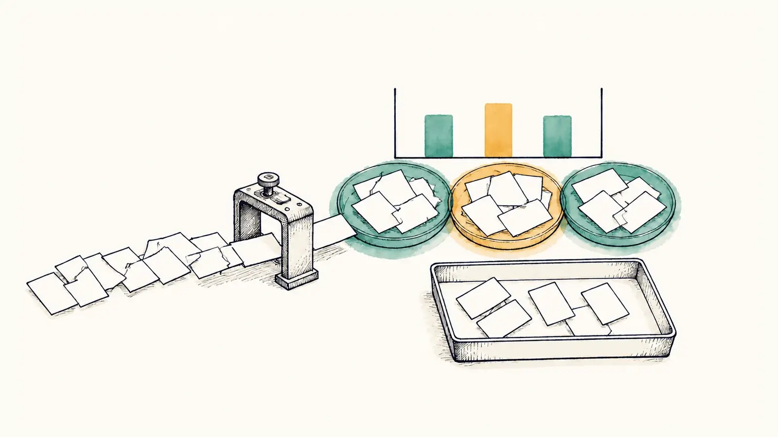
One of the most useful charts I built in Codex Log Viewer was also misleading in a way that no rendering test could catch.
The Project Focus view was meant to show what my work with AI coding agents was actually about. Raw message counts could tell me how many prompts I submitted. Token totals could show how much model capacity the sessions used. Neither could tell me whether I was spending the work on planning, implementation, testing, release, analysis, or review.
So I added a classifier. It assigned submitted messages to activity categories and turned the result into a chart. The view rendered cleanly. The counts reflected what the classifier had produced. But too many messages landed in other, and the chart did not yet describe the work well enough to serve its purpose.
Nothing in that result proved the taxonomy was wrong. The messages might genuinely mix several kinds of work or remain too ambiguous to classify. My categories might have reflected the way I imagined the work rather than the way it appeared in the logs. The classifier itself might have missed repeatable language that would become obvious once I inspected the underlying prompts. The other bucket gave me evidence without giving me a conclusion.
The same interface held several kinds of evidence that did not carry equal certainty. A message count was an exact value produced from the local logs. Project Focus was an inferred view produced by rules about what the message meant. They could sit beside each other in the same polished interface, even though they deserved different levels of confidence.
I had designed the rest of the product around that problem. The logs can contain prompts, code, file paths, command output, and business context, so the viewer stayed local-first. The parser kept unknown events visible instead of silently discarding them. Exact values stayed distinguishable from inferred ones. The product needed to be honest about what it knew before it could help me reason about the work.
The chart created a smaller decision. I could inspect the messages behind other, look for recurring patterns the existing categories failed to recognize, and refine the classifier where the source supported a change. That was enough work for the evidence available. It did not require a claim about productivity, a universal taxonomy of software development, or a story about what every team should measure.
Evidence has an honest radius
Early product evidence often arrives with this shape. It can support one next move while remaining far too narrow for a larger conclusion.
Teams can mishandle that boundary in two directions. They stretch a promising signal until it appears to justify the decision they already want, or they dismiss the signal because it cannot support a broad commitment. Both responses ask the evidence to operate at the wrong scale.
Enough evidence for what?
The Project Focus result was enough to justify examining the unclassified messages. If that review exposed recurring kinds of work, it could support a targeted classifier change. A revised classifier would still need its own review before the chart deserved more authority. The original other bucket could not tell me whether my overall operating pattern was healthy, whether one project deserved more attention, or whether another person should organize their work the same way. Those are different decisions, and they should not inherit confidence merely because they appear downstream from the same chart.
Even a better classifier would leave another boundary intact. A category count can say how many messages the rules placed in testing or implementation. It cannot say how valuable that work was. More testing prompts could reflect stronger verification or a workflow that kept breaking. One planning prompt could change the direction of hours of implementation. Project Focus can make the distribution of activity inspectable, but it cannot become a productivity score without evidence that the categories and counts represent productivity.
Product judgment enters before a dashboard becomes an authority. The classifier output can tell me which messages received which label. It cannot decide whether other represents a product defect, an honest unknown, or a limitation in the categories I chose. The next step depends on what question the product is trying to answer and how much the available evidence can support.
Matching the decision to the evidence is more disciplined than waiting for certainty. Waiting would not improve the classifier by itself. It is also more disciplined than forcing every message into a named category. A complete-looking distribution may be less truthful if the source does not support the labels.
Preserving unknowns was therefore part of the product logic, not cleanup deferred until later. An unknown event in the parser and an other message in Project Focus are different things, but they express the same restraint. The system should not manufacture confidence simply because an interface has room for a value.
When teams say the data is incomplete, they often talk as though the only choices are delay or instinct. There is another move: narrow the decision. A small amount of evidence may support investigation. A repeated pattern may support a reversible change to the model or taxonomy. Broader use requires stronger confidence. The sequence matters because each step should produce evidence for the next one instead of borrowing authority from an eventual outcome.

In Project Focus, the responsible next move lived close to the source. I needed to read the messages, understand why they remained unclassified, and decide whether a repeatable rule existed. The dashboard showed where to look. The source material had to decide whether the product should change.
Taste has to survive correction
My reaction to the first Project Focus chart was a form of product taste: this view does not describe the work well enough.
That judgment was useful because it compared the artifact with the product's intended purpose. Project Focus was supposed to make engineering attention more legible. A large other bucket made the view less explanatory, even when every bar and count rendered correctly.
The same judgment was dangerous if I treated it as self-validating. I could have decided that a good chart should contain less other and changed the classifier until the distribution looked more satisfying. That would have improved the appearance of the answer without showing that the new labels were more accurate.
Seniority can magnify this risk. “This feels wrong” can move a team quickly, especially when the available data is still thin. The concern may reflect real customer understanding or hard-earned domain knowledge. It may also reflect an expectation the evidence does not share. Confidence and experience cannot settle which one it is.
The way out is to translate taste into something the product can challenge. In this case, the hypothesis was straightforward: if Project Focus was missing repeatable kinds of work, then reviewing the messages in other should reveal recurring patterns that the existing categories ought to recognize. If the messages remained genuinely mixed after inspection, the chart might be telling the truth and my mental model would need to change.
The difficult part is allowing that second result to count. If I define success as a smaller other bucket, I can keep adding rules until the chart appears decisive. A useful refinement has to improve fidelity to the underlying messages, not merely coverage. Otherwise the classifier learns my preferred picture of the work and the dashboard becomes less trustworthy as it becomes more complete.
Product taste becomes useful when it produces an observable hypothesis that can correct the person who raised it.
That is different from asking data to approve an opinion. The hypothesis specifies the observation that could weaken the original judgment. It keeps the source closer than the chart and gives an honest negative result somewhere to go.
It also changes how a PM can act before the evidence is statistically clean or operationally mature. Customer language, observed product behavior, and domain experience may all reveal something the current measurement cannot represent. Their value comes from making the next uncertainty more specific. They do not receive authority over a larger decision simply because the PM finds them persuasive.
“Before the dashboard” does not mean before evidence or in defiance of it. The evidence in Codex Log Viewer existed in the underlying messages before it became a category distribution. The work of judgment was to decide what the chart could honestly claim, which next change the source could support, and what result would require me to revise my belief.
The classifier improved through patterns found in real messages. A zero other bucket would not have been evidence of success. A message that did not fit the supported categories needed to remain unresolved, even if the chart looked less complete as a result.
The final decision was narrow: refine the classifier when the source revealed a repeatable missed pattern, then inspect the result again. If the remaining messages did not reveal such a pattern, the classifier had not failed in the way I suspected. The honest response would be to leave them in other and change my expectation of what the chart should show.
This writing reflects my personal perspectives on product management, AI, and content discovery. It does not represent the official position of my employer or any affiliated organization.