Note
May 14, 2026
1 min read
Codex, Product Taste, and the Problem of Too Much UI
By Cristiano Pierry
Codex made the AMA page work, but repeated Bob across nearly every element. Functionality still needed hierarchy and restraint.
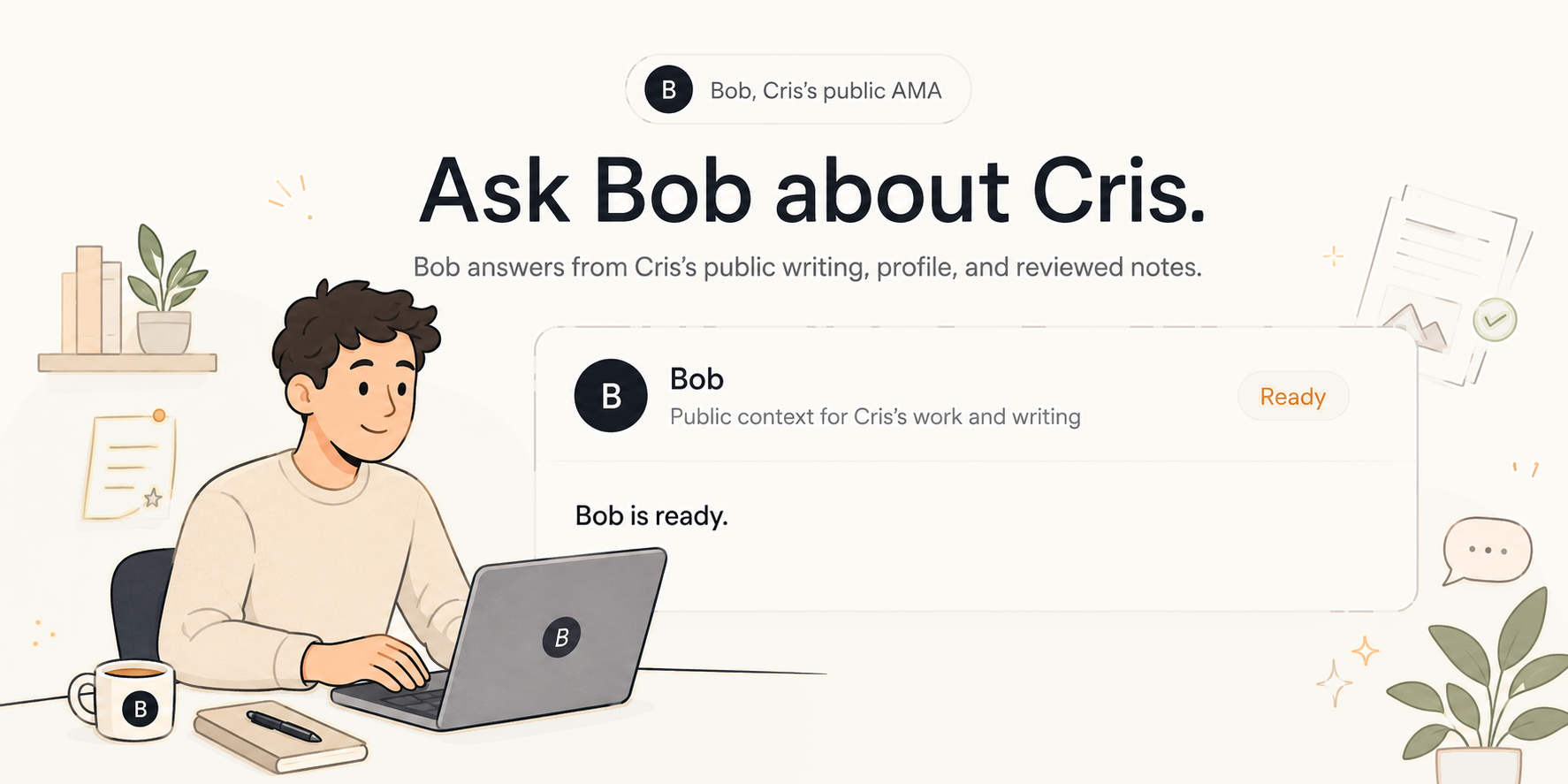
OpenAI Codex has become one of my most useful tools for building quickly. I still see a gap in its design sensitivity.
I was creating an AMA section for my personal website. The page introduced Bob, a public assistant that answers questions about my writing, profile, and notes. The first version worked, but it repeated Bob everywhere: in the badge, headline, card, status, and body copy.
The interface was functional. It was not refined.
Some of that is on me. A better prompt could have specified the hierarchy, tolerance for repetition, and desired restraint. Even so, I notice this more with Codex than with some other models. It is strong at implementation and architecture, but less naturally sensitive to product taste and the small copy decisions that make a page feel considered.
“Working” and “designed” are not the same thing.

The page did not need another component. It needed someone to notice how many times the same idea was competing for attention and remove what the design had not earned.
This writing reflects my personal perspectives on product management, AI, and content discovery. It does not represent the official position of my employer or any affiliated organization.